Adding bleed to die cut images

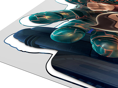
This is a topic that comes up every so often with graphic designers who are new to working with corrugated POP displays, or small business owners who are preparing art by themselves. Adding bleed to die cut images usually isn’t too difficult until you need to die cut around a person or a product. The different textures of skin, hair, and fabric can be difficult and frustrating to bleed, but it can be done. Some designers will simply cut into the image a little, or just not bleed that part of the image at all and hope for the best. But we need to remember that the client is investing a lot of money into getting their brand out there onto retails floors, and a little extra time will yield a much more appealing finished product. Below I will walk you through the steps we take to add bleed to images using Adobe Photoshop, Illustrator, and Indesign.

Add bleed to die cut image

How much bleed do I need to add?

If you are working on very small pieces, up to 12″ x 18″ (30cm x 46cm), then 1/8″ (3mm) should be fine, but it’s right around this size that we will start adding 1/4″ (6mm) of bleed. I know what you’re thinking… If the die cut is that far out then that job is going to look terrible. And I agree with you, if your die cuts are that far out then you need to be looking for a new die cutter. But with very large pieces, it is possible for some of the cuts to be out by 1/8″. Especially if you are laminating printed sheets to corrugated board then die cutting, because there are two processes and you will need to allow for a margin of error in each one. If your bleeds are done properly, you can be out by 1/8″ on larger pieces and no one will ever notice.

Adding bleed in Adobe Photoshop

The majority of artwork we receive that doesn’t have bleed has been created completely in Photoshop. Luckily it’s easier to add bleed to a design that is created completely in photoshop than it is to one that is created in Illustrator or Indesign with a few linked images hanging over the edges here and there, but we’ll get to that shortly.

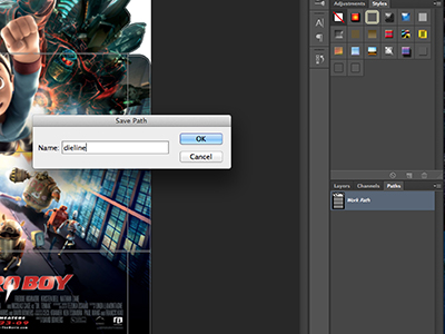
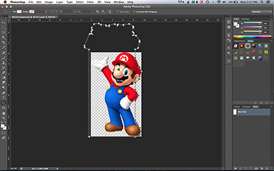
First things first, let’s check the size of the artwork. Hopefully it was created at full size or half size to make things easier on us. Did the designer include a die line in their art to indicate how they would like it cut? If an Illustrator die line file was not included with the art let’s take a look in the paths tab to see if there is one there. If a die line wasn’t provided and there’s nothing in the paths tab, you will need to create a dieline with the pen tool. Do this by selecting the pen tool, and set the drop down box near the top of the screen to Path (figure 1.1). Create a path that follows the edge of the artwork using as few points as possible. Click and drag with the pen tool to make nice smooth curves. Small jagged cuts won’t look good, and may not even be possible if the cuts are too small and tight. Once your dieline is complete, go to the paths pallet and double click the layer to change it’s name to “dieline”.

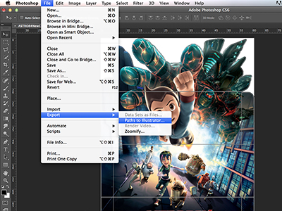
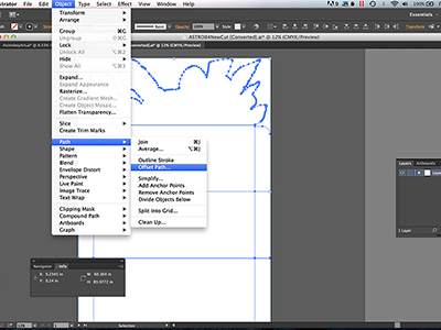
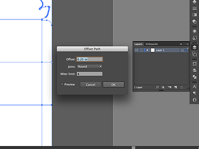
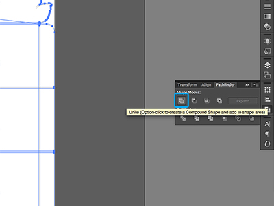
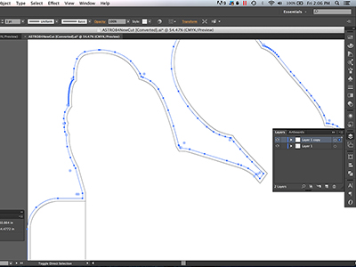
Now that we have our die line, we want to make sure that our bleed is nice and clean, it’s also nice to have a clipping path we can use when laying out our artwork in case we are printing multiple pieces up on one sheet. We’re going to export the dieline path to Illustrator then expand it by whatever amount of bleed we need. If the artwork is at full size and we want 1/4″ of bleed, we will expand it by 1/4″. If the art is at half size and we want 1/4″ of bleed, we will expand it by 1/8″ since we will be scaling it up by 200% in our layout. Simple, right? Click File>Export>Paths to Illustrator, and save the dieline path somewhere you will be able to find it. Open the dieline path in Illustrator, select all the lines and give them a black stroke. Now make a duplicate of the layer by dragging it onto the new layer button, and lock the original layer. Select all the lines on the new duplicate layer and Click Object>Path>Offset Path, enter the amount of bleed you plan to add in the Offset box and set joins to Round. Don’t worry about the miter limit box. Click okay and voila! You probably have a beautiful mess of lines overlapping one another. Don’t worry, we aren’t done yet. Select all the lines and go to the pathfinder pallet. Click the Unite button to merge all those lines together. If your path was very complex you may have some leftover little paths here and there or another offset line that is inside the die line area. Select all the lines then click Object>Ungroup or Object>Compound Path>Release as necessary to free the line you want from those other bits. Delete all the inside paths that won’t be needed for your bleed path. Now you can unlock the original layer that has your die line on it, and select the original die line and the shiny new offset path that we will use to keep our bleed nice and uniform. Click Cmd C (Ctrl C on PC) to copy those files. Go back to Photoshop and hit Cmd V (Ctrl V on PC) to paste the lines into your file and select paste as path in the dialogue window that pops up. Select both lines and move them as necessary so that the dieline path lines up with the outline of your artwork. If your new paths were pasted into the same path layer as the dieline you created earlier, you will need to move them to their own layer. Once you have them in position, click Cmd X (Ctrl X on PC) to cut them from that layer, then click the new layer button at the bottom of the paths pallet, and hit Cmd V (Ctrl V on PC) to paste them into the new layer. They will land in the same position they were on the other layer. Double click that layer and name the layer “bleed”. Delete the inner die line path from the bleed layer. Now you have a path layer named dieline with a path that follows the artwork, and another layer named bleed that is offset from the dieline by the amount of bleed you want to add.

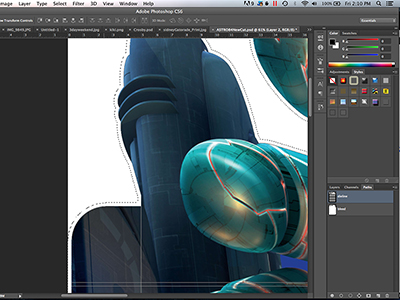
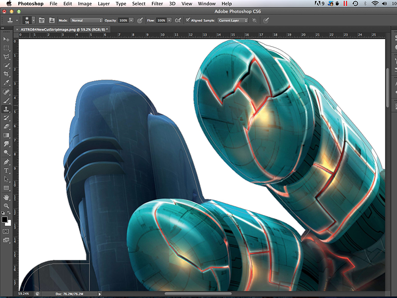
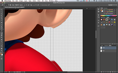
Make a selection of your bleed path by holding down the Cmd (Ctrl on PC) button and click the bleed path layer. You should now see the marching ants around your bleed area. Next I like to click on the dieline layer so that we can see where the image will be cut. This comes in handy after you’ve applied some of the bleed and it’s less clear where the cut line is.

If you are working on a flat photoshop file with only one layer then we can start bleeding the image on that layer, which I find to be quicker, but keep in mind that it could create more work for you later if there are changes to the art. If you are working on a multi layer Photoshop file, go ahead and create a new layer above the artwork layer and name it bleed. To add the bleed, we are going to be using either the clone stamp tool, the brush tool, or both. Solid colours can be bled with the brush tool, and complex textures like fabrics, grass, skin, and hair can be bled with the clone stamp tool.

Adding bleed with the brush tool:

When using the brush tool to bleed solid colours, select a medium sized brush by right clicking on the art to bring up the brush pallet, and adjust the brush size with the slider. Set the hardness to 0%. With the brush tool selected, hold down the Cmd (Ctrl on PC) button to bring up the eye dropper tool and left click on the colour you would like to sample. With the proper colour selected you can start to brush in the bleed, overlapping the artwork just enough so that there won’t be a hard transition at the cut line. If the colour you are bleeding is a gradient or has gradual changes in shade, you will be better off using the clone stamp tool than the brush. If the solid colour you are bleeding meets a different solid colour, you will want to increase the hardness of the brush to 100% for that spot, or switch to the clone stamp tool so that you can have a nice sharp transition from one colour to the next.

Adding bleed with the clone stamp tool:

Adding bleed with the clone stamp tool can be very time consuming, but it can also give you the very best results if done properly. Let’s get started…

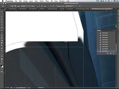
With our bleed path selected, choose the clone stamp tool and right click on the artwork. From the pop up dialogue, move the slider to adjust the tool size and set the hardness to 0%. Select the layer with the art you will be bleeding and hold down the Cmd (Ctrl on PC) button to bring up the target tool. With the target tool over the sample area, click the left mouse button to select the sample area. Now click on your bleed layer if you are working on a multi layer file, and move the clone stamp tool to the bleed area and hold down the left mouse button to start cloning in the bleed. Be sure to overlap the art slightly so that you have a smooth transition from image to bleed without changing the edge of the art too much. Depending on the texture you will be cloning, it is sometimes beneficial to offset the sampled image from where you are applying the bleed. This will make the bleed look more natural and less repetitive. The amount of offset will be dictated by the pattern or texture that you are bleeding. This process can be difficult and intimidating at first, but just like anything, it gets easier the more you do it.
Path path

Figure 1.1

Rename path

Figure 1.2

Export path

Figure 1.3

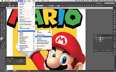
Offset path

Figure 1.4

Offset path

Figure 1.5

Unite path

Figure 1.6

Offset path complete

Figure 1.7

Bleed selected

Figure 1.8

Brush tool

Figure 1.9

Clone stamp tool

Figure 1.10

Bleed complete

Figure 1.11

Adding bleed in Adobe Illustrator

Adding bleed to vector images can be as simple as stretching a background vector shape over the edges of the die line, but it becomes a little trickier if you have a placed Photoshop image hanging over the edge of the vector background and you want to cut around it, so that’s what we will focus on. Let’s get into it…

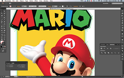
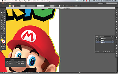
After drawing the die line on it’s own layer with the pen tool, I always start out by expanding the die line by the amount of bleed that I want. This makes a nice and even bleed shape that will make it easier to nest multiple pieces together on one sheet. To do this, copy your die line layer by dragging it onto the new layer button, and lock the original die line and art layers. Select all the lines by clicking Cmd+A (Ctrl+A on PC), then click Object>Path>Offset Path (figure 2.1). Set the offset to the amount of bleed you want, and set joins to round. If the result is a lot of disconnected shapes (figure 2.2), you can select all again and click Unite on the Pathfinder pallet (figure 2.3). Delete any unwanted lines and your bleed path is set. You may need to ungroup or release compound paths to free up that bleed path from other lines on the layer before being able to delete them. Name this layer bleed, and move it down so that it is underneath all the other layers. Use the eyedropper tool to select the background colour you would like to bleed out to fill this path with that colour (figure 2.3). If there are other vector elements that touch the edge of the dieline, you can bleed them over the dieline by either unlocking the art layer and dragging their points with the white arrow tool, or you can draw the bleed in with the pen tool. I like to do a combination of both depending on what will be easier with the art I’m working on. I will usually use the pen tool, and if I need to drag any points around I can just hold down the Cmd (Ctrl on PC) button to activate the white arrow tool.

Now we come to a raster image (photoshop file) that is hanging over the edge of the artwork. What now?!! In an ideal world, the placed photoshop file will have been placed at 100% scale. Unfortunately this isn’t an ideal world and that is almost never the case. How do we know how much bleed to add if the scale is different when we open the file in Photoshop? How do we know where to start and stop the bleed if only some of the image is hanging over the edge?

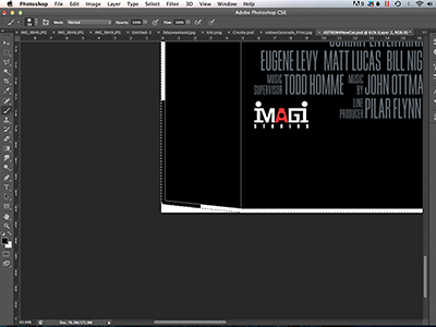
We don’t want any bleed to show up inside the artwork that won’t be cut away, so we are going to need to open the raster image in Photoshop and paste the dieline and bleed lines into the paths folder (figure 2.5). But the scale is off!!! If the placed raster image was scaled up by 200% in your Illustrator layout, then it’s going to be half the size when you open it up in Photoshop. You can do some math, which can be simple if the placed image is really scaled up at exactly 200%, and just scale your dieline and bleed lines down to 50% in Illustrator before copying and pasting them into Photoshop. Unfortunately the placed image is probably going to be scaled to 117% or something like that, and the scale amounts shown in Illustrator’s links pallet are not very accurate. The easiest thing to do is to just select the dieline and bleed lines in Photoshop with the black arrow tool and hit Cmd+T (Ctrl+T on PC) to use the transform tool to scale the paths to fit along the edge of the raster image. Once your dieline is lined up with the edge of the image, select the bleed line and cut it from that layer by clicking Cmd+X (Ctrl+X on PC). Create a new path layer by clicking the new layer button, and paste the bleed path onto the new layer by clicking Cmd+V (Ctrl+V on PC). Name the new layer “Bleed”.

If the Photoshop document is larger than the image and your bleed lines fit inside the document window then you’ve got it made in the shade. If the document is cropped tight to the edge of the image, you will need to adjust the canvas size to make the document large enough to include your bleed. If you are adding 1/8″ (3mm) of bleed, we will need to make the canvas size 1/4″ (6mm) larger. Click Image>Canvas Size and add .25″ or 6mm to both the width and the height. Take note of the amount added because you will need it later. This is going to help us keep the same placement in the Illustrator file after the bleed has been added. Use the clone stamp or brush tools as described in the previous section to add bleed to the image. Taper the bleed off where the dieline shows that your raster image meets the vector background (figure 2.6).

If you are working in a file format that allows transparent backgrounds, then it’s time to save your file and move back to Adobe Illustrator. If you are working with a file format that doesn’t allow transparent backgrounds then you will need to create a clipping path that clips tight around the image when it is inside the dieline area, and then transitions to clipping tightly around the bleed when it is outside the dieline area before saving your file and moving back to Illustrator.

If you saved over the linked file, when you move back to Illustrator you will be greeted with a dialogue box asking if you would like to update the modified files. If you didn’t adjust the canvas size of any of those images then go ahead and click Yes. Your image will update to the newly saved version with bleed. If you did adjust the canvas size, click No, and open the links pallet Window>Links. You will see a list of all the linked images in your document, with little yellow triangles next to any images that have been modified. The default settings in Illustrator will resize any images that have been cropped, and they will no longer line up with the dieline.

If the placed image was not resized after being placed, and is at 100% scale (double click the image in the links pallet to show this information), you can select the image on the links pallet then click the menu button in the top right corner and select Placement Options from the list. Next to Preserve, select File Dimensions, and click okay. Now we can select the modified image in the links pallet and click the links pallet menu button again. This time select Update Link. Your linked image should be in the same position with the bleed you added in Photoshop hanging over the edge of the dieline. This method will only work if the placed image is at 100% scale!

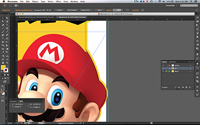
If the placed image was resized and is not at 100% scale, it will require a couple more steps to make the newly bled image end up in the correct spot on your layout after updating. Click on the image that needs to be updated to reveal the bounding box lines. Turn on the document rulers by clicking Cmd+R (Ctrl+R on PC), then click and drag a ruler guide from the side or top of the window and place the guide half the distance from the edge of your image bounding box that you increased the canvas size by. If you increased the canvas size by 1/4″ (6mm), place the ruler guide 1/8″ (3mm) from the edge of the bounding box. Go back to the links pallet and click on the image that needs to be updated. Click the links pallet menu button and select Update Link from the list. You will see that the updated image no longer lines up with your dieline (figure 2.7). Click on the image in the layout to reveal the transform handles. Hold down Option+Shift (alt+shift on PC) to perform a centre weighted transform, and drag the transform handle until it meets the ruler guide. Turning on smart guides under the View menu will help your transform snap to the ruler guide. Your updated image should now be in the original spot with bleed extending over the dieline (figure 2.8).

Offset path

Figure 2.1

Offset path

Figure 2.2

Unite path

Figure 2.3

Unite path

Figure 2.4

Paste dieline

Figure 2.5

Bleed in Photoshop

Figure 2.6

Relinked image

Figure 2.7

With bleed

Figure 2.8

Adding bleed in Adobe Indesign

Adding bleed in Adobe Indesign is very similar to adding bleed in Adobe Illustrator, but the way that you place images into the document is a little different. Indesign allows you to have vector shapes filled with colour just like Illustrator, and you can place images onto your document the same way Illustrator does as well. If you use File>Place to place images into your document, Indesign will place them inside a rectangle frame that you can then resize as you want. I personally usually use the rectangle frame tool to create my own frame, then hit Cmd+D (Ctrl+D on PC) to bring up the place dialogue box where you can select your image, but to each their own.

As you learned from the previous sections on adding bleed in Photoshop and Illustrator, you know that I like to expand the dieline to create a nice bleed path to follow. Unfortunately it’s not always that easy to use a path like that in Adobe Indesign, depending on how the artwork is set up. When adding bleed to someone else’s artwork in Indesign, I usually just use the rulers to make sure that I’ve added enough bleed. If I was setting up the art from scratch, I would use an expanded bleed path for my background, but setting that up on someone else’s artwork can be difficult and time consuming. It can also put you at risk of accidentally shifting some elements of their artwork. If you don’t like using the rulers, you could create a new layer and place a nice bleed path outline (created in Adobe Illustrator) above the artwork layer, then lock it and use that as a visual aid to make sure you are adding enough bleed.

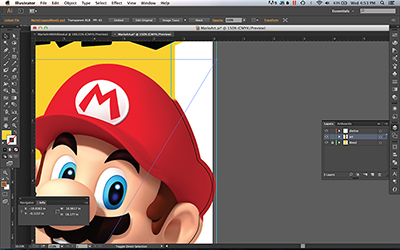
To add bleed to vector shapes, select the white arrow tool and use it to select points or lines and drag them beyond the dieline by the desired amount of bleed (figure 3.1). Hold the shift key to select multiple paths or points to be moved at the same time. You need to be very cautious when dragging these elements around to make sure that you don’t accidentally alter the artwork. If the shape you are modifying contains a gradient, there is a chance that it will change as you drag around it’s frame. Sometimes it makes sense to add new points to the edge of a frame and just drag those points over instead of altering the original paths. Doing it this way can be helpful if the original path is curved, and dragging over the point at the end of the curve will alter the shape. Paths and points can sometimes remain selected after you finish moving them, so you may need to click somewhere else to release the selection before clicking different points and paths to move.

Adding bleed to raster images placed in Indesign can be a little tricky. Adding the bleed is done in Photoshop using the methods described in the previous section, then the image link needs to be updated in Indesign. I am not a fan of the way Adobe Indesign handles images that have been cropped or resized. Indesign will keep the top left corner of that image in the exact same position relative to the frame the image is in, and there is no way that I know of to change that. This makes sense for most users, but it creates a problem for me when I have to add bleed to an image and I need to increase the size of the canvas in Photoshop. If I make the canvas 1/4″ wider and 1/4″ taller to make space for bleed, when I move back into Indesign and update that image, the image is going to look like it has shifted over because Indesign has kept the top left corner of the image in the same position, and now the image no longer lines up with the dieline. If the placed image has not been scaled in Adobe Indesign, then the solution that I use is to increase the size of the rectangle frame tool by the same amount that you have increased size of the image in Photoshop. If the Photoshop image has been made 1/4″ wider, I will turn on the rulers in Indesign by clicking Cmd+R (Ctrl+R on PC), then I will zero the ruler at the top left corner of the image frame by clicking and dragging from the top left corner of the document where the vertical and horizontal rulers meet, down to the top left corner of the image frame. Then I will place a guide line at 1/4″ from the edge of the frame by clicking and dragging over from the ruler at the edge of the document to the 1/4″ mark. Then I click and drag the edge of the rectangle frame to expand it over to the guide. You don’t need to add the guides, but I like to zoom in and get the guides into the exact spot I need them to be, then the rectangle frame will snap right to it when I expand it. If you increased your frame size by the same amount that the Photoshop file was increased, the image should stay where it is supposed to after updating the link. Now, if you only needed to crop the image larger on the right or bottom edge of your image, then your image won’t shift after updating it. You can just increase the size of the image frame so that all of the bleed is visible.

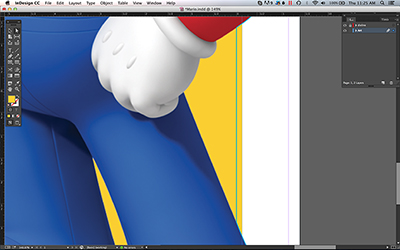
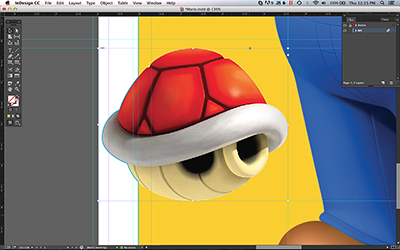
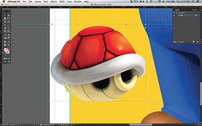
If the image has been scaled in Adobe Indesign, then increasing the size of the image frame may not be the easiest solution. Another way to make sure that the updated image ends up in it’s original position is to drag ruler guide lines over to the edges of the art that haven’t received any bleed (Figure 3.2). After updating the image you can expand the image frame if any part of the image has fallen out of frame (Figure 3.3), then nudge it back into position with the arrow keys on your keyboard. Once the edges of the art line up with the ruler guide lines, your bleed should be hanging over the dieline (Figure 3.4). Extend any remaining vector shapes so that they bleed over the dieline as well (Figure 3.5), and you’re all done.

That pretty much covers it. Do you have any tips and tricks for adding bleed? Please share them in the comments!

Vector bleed

Figure 3.1

Reduce image frame

Figure 3.2

Updated link

Figure 3.3

Move image frame

Figure 3.4

Image with bleed

Figure 3.5